Elevating Automotive Sound Design
Deliverables
Sonic Branding, Strategy and UX Sound Design for Lucid Air
Application
In Car UX, TV Advertising, Digital, Social
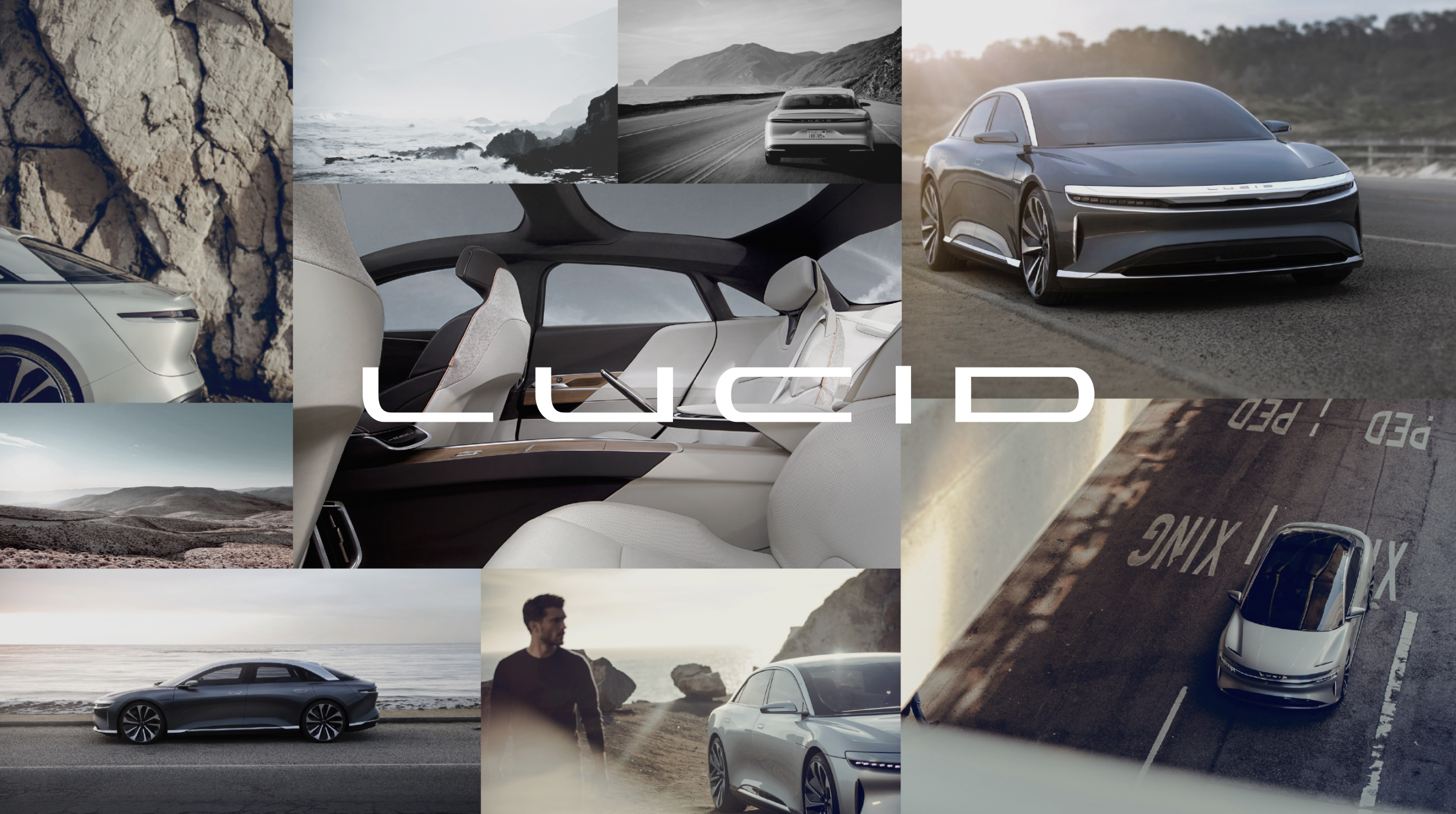
Lucid Air Project Overview
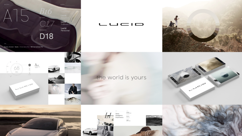
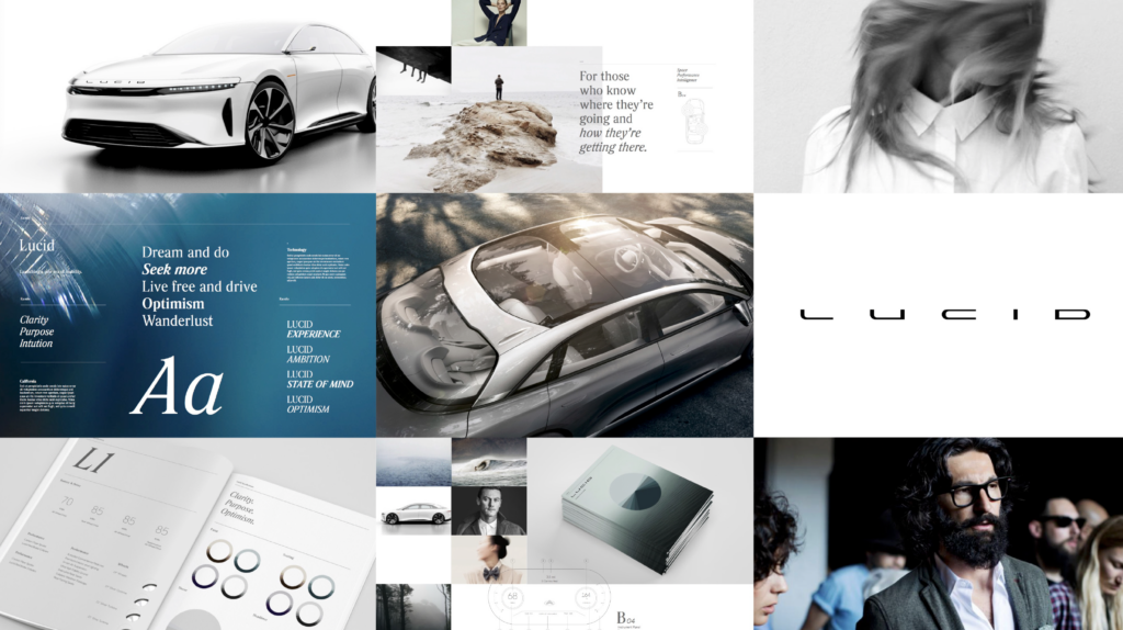
Lucid Motors challenged us to match their groundbreaking design with an equally refined sonic identity. Over two years, we collaborated closely with their brand and UX teams to craft a cohesive sound ecosystem for the Lucid Air – representing a new standard in automotive sound design. Our approach has shaped a modern standard for automotive sound design, built around emotion, elegance, and intention.
The Sound of Future Luxury
Designing sound for the Lucid Air meant balancing clarity with character. While usability came first, we also aimed to capture Lucid’s vision of future luxury and intelligent design. We crafted a warm, rich sound palette using layered harmonics, spatial depth, and flowing melodic phrases. Inspired by the idea of air and motion, we wove in natural sonic textures to enhance immersion and reflect the brand’s distinctive voice.
Future Luxury System
-
Sorry, your browser does not support this audio format.
Melodic Phrasing
Soft rhodes phrasings that blend together
-
Sorry, your browser does not support this audio format.
Harmonic Textures
Harmonic textures that add depth
-
Sorry, your browser does not support this audio format.
Organic Textures
Organic textures that give a sense of space and movement
-
Sorry, your browser does not support this audio format.
Warm Harmonic Beds
Rich harmonic beds that ground the soundscape
Designing a System for Automotive Sound
The Lucid Air sound system was designed with a high level of detail and intention—building emotional resonance while supporting intuitive driver interaction. From startup sequences to turn signals and alerts, every element serves a purpose. By embedding audio into the overall product design process, we helped Lucid deliver an experience where automotive sound design enhances both usability and luxury.
The welcome experience and ringtone are both longer form key brand moments. For Welcome, we created a melody that follows the 5 letters in Lucid while having a soft, ethereal textures to support the visuals of the car waking up.
Spectrum of Design
Every UX sound ecosystem starts with intent. We begin by mapping interactions along a spectrum – from Branded to Functional, and Calm to Urgent. In automotive sound design, scaling urgency is critical: sound must clearly cue driver response without causing distraction. This framework guides how we shape sonic behaviors across the experience balancing brand expression with functional clarity.
Branded Sounds: More layered, colorful or melodic and longer form.
Functional Sounds: Simplistic, minimal layers, less melodic, shorter form.
Calm Sound: Softer timbre, low to mid range frequencies, slower cadence patterns, longer decay, consonant harmony.
Urgent Sounds: Percussive timbre, higher range frequencies, faster cadence patterns, tight decay, potential dissonant harmony
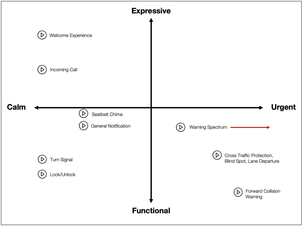
Spectrum of Design Examples
-
Sorry, your browser does not support this audio format.
Branded (Welcome)
Layered, colorful or melodic and longer form
-
Sorry, your browser does not support this audio format.
Functional (Turn Signal)
Simplistic, minimal layers, less melodic
-
Sorry, your browser does not support this audio format.
Calm (Seatbelt Chime)
Softer timbre, slower cadence patterns, longer decay, consonant harmony
-
Sorry, your browser does not support this audio format.
Urgent (Cross Traffic Protection)
Percussive timbre, higher range frequencies, faster cadence patterns, tight decay, potential dissonant harmony
Let’s Talk Automotive Sound Design
Looking to elevate your in-car experience through purposeful sound. We create automotive sound design systems that combine utility, emotion, and identity. Contact us to start building your sonic experience.
Similar Projects

The Guardian Interview on Automotive Sound
When The Guardian asked the question, “How should electric vehicles sound?” it showed that the conversation around E

Nodes of Design Podcast : Audio User Experience Design
Unlocking the World of Audio UX with Connor Moore What makes an app feel effortless, while another leaves you frustrated