Audio Brand Strategy
Deliverables
Audio Brand Strategy & Custom App Sound Design
Application
Uber Drivers App & Uber Eats App
Uber’s Audio Brand Strategy
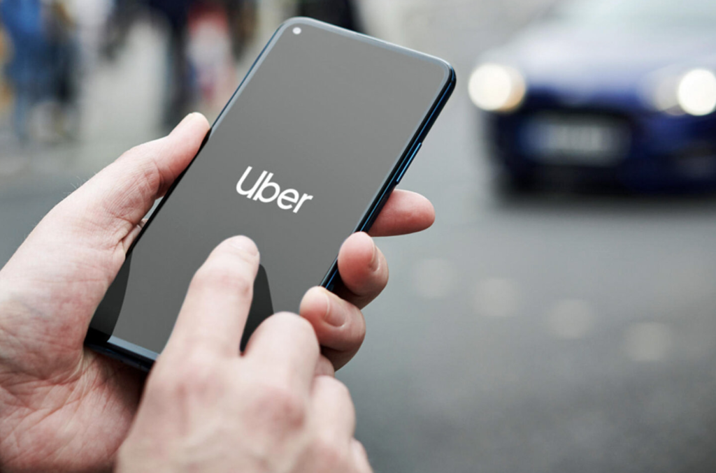
Uber partnered with us to develop an audio brand strategy focused on creating signature app sounds for key user moments, particularly driver alerts and notifications. Given their functional purpose, we designed sounds that are instantly recognizable yet unobtrusive, ensuring clarity without pulling attention away from the road.
Designing the Sonic DNA
We began with in-depth research, stakeholder interviews, and a brand workshop to define the foundation of Uber’s audio brand strategy. We crafted a clean, minimal, and communicative tonal palette—distinct from competitors and effective across diverse driving scenarios.
Design System
-
Sorry, your browser does not support this audio format.
Motion and Speed
Subtle delay and flutter effects were layered in to create a sense of dynamic movement.
-
Sorry, your browser does not support this audio format.
Premium and Clear
A combination of muted and bright tones were used to create premium-sounding, multi-layered timbres that remain clear in real-world conditions.
-
Sorry, your browser does not support this audio format.
Sense of Reward
Melodic cues were composed to create a rewarding auditory experience, reinforcing positive user interactions.


Process
We collaborated closely with Uber’s design team to ensure the sounds were both on-brand and effective across various environments. Through iterative testing in different settings, from quiet interiors to loud, chaotic environments, we fine-tuned the sound experience to be impactful without causing fatigue.
Impact
Uber’s app sounds are now heard millions of times a day by drivers and passengers worldwide.These sounds have become core assets in Uber’s marketing efforts, amplifying brand presence across digital, TV, and social channels.
We optimized and tested the sounds in some of the loudest areas of San Francisco to ensure that they were clear and communicative to the end user.
Reach out to learn how we can help you design a sound experience that resonates.

Uber In App Sounds
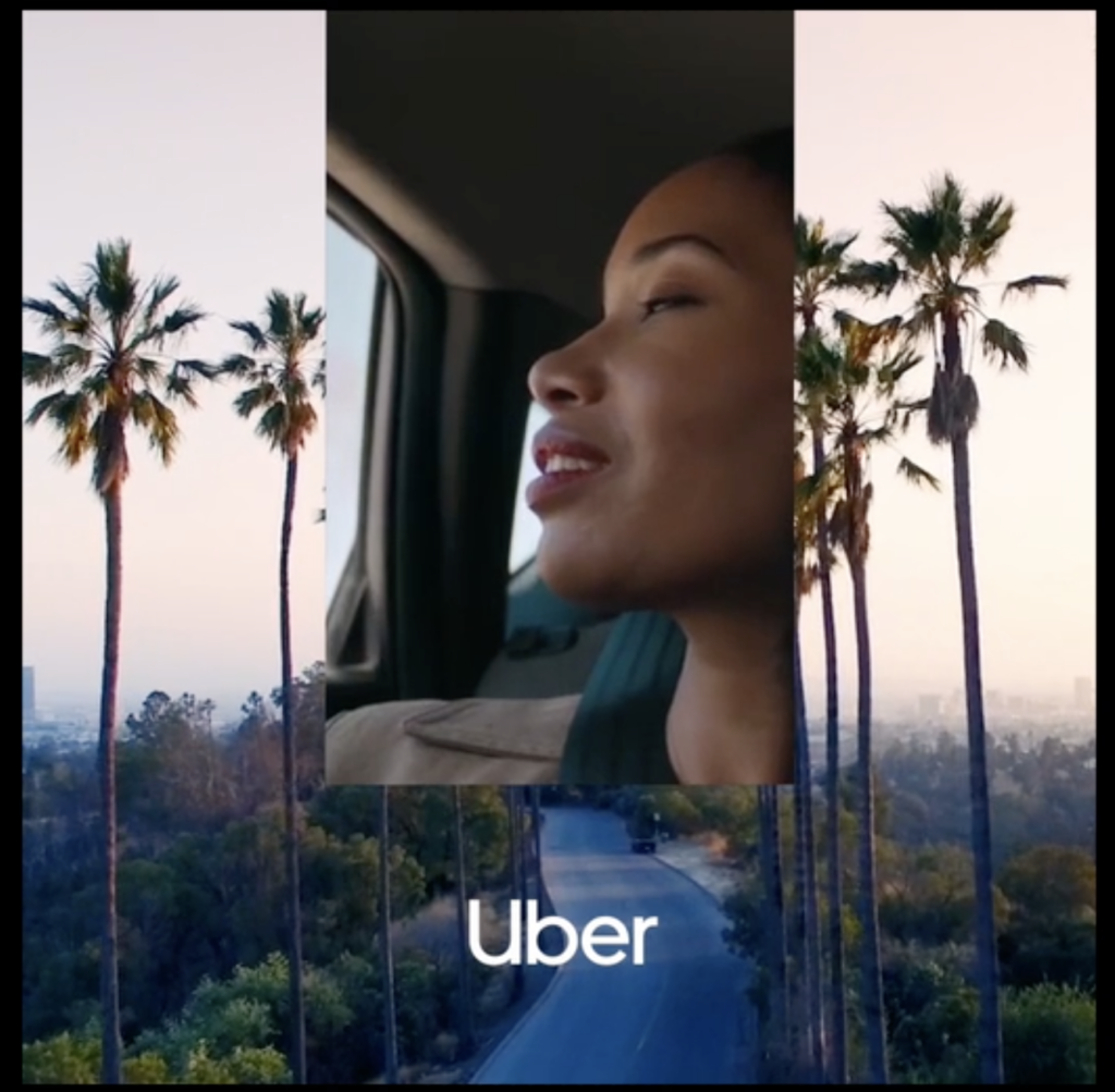
Image, sound, and vibration were paired with alerts so that no matter how the phone is used—on a phone mount in a car, attached to the handles of a bicycle, or in a courier’s pocket while walking to deliver a meal—on-trip alerts are always easily accessible and understood.
Evelyn Kim,
Senior Design Manager, Uber
