Peloton
- Deliverables
- Audio UX for Full Product Line, Audio Brand Strategy, Brand Music
- Application
- Peloton Bike, Tread, Rower, Gaming, and Guide
Project Overview
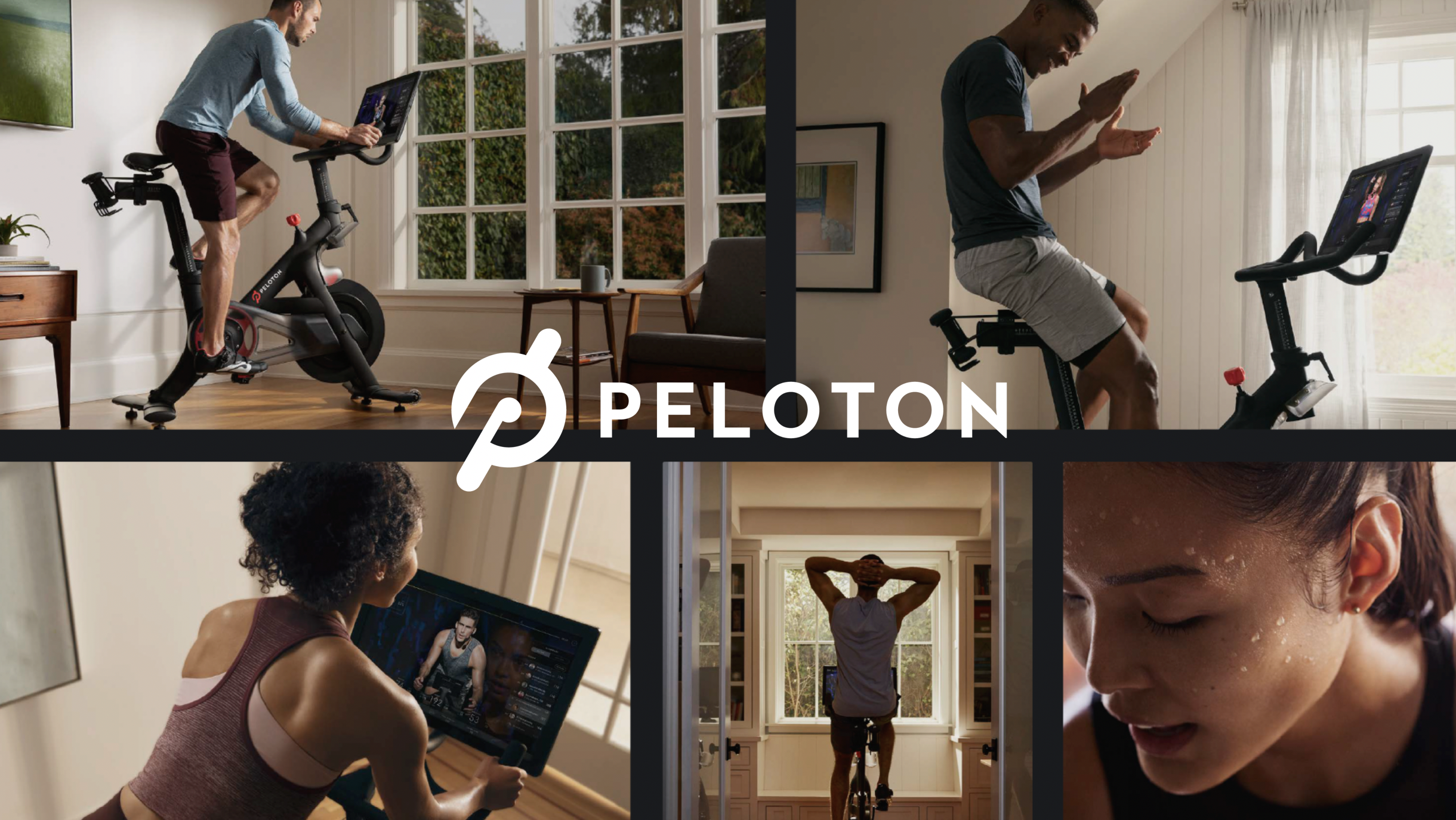
Over the last several years, we’ve been lucky to have Peloton as one of our primary partners. Over the course of the ongoing partnership, we have served as an embedded team member of their UX and Brand Design teams in developing their audio brand strategy and audio ux ecosystem that spans their entire product line (Bike, Tread, Rower and Guide), and gaming platform (Lanebreak).

Design Principles
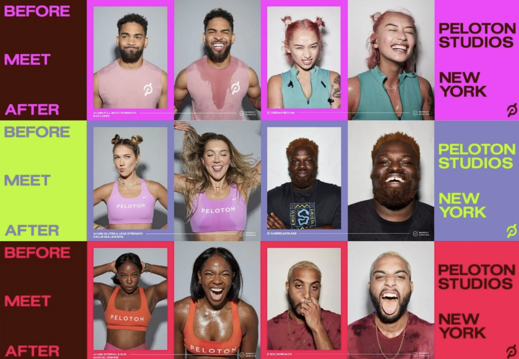
Collaborating with the UX and brand teams, we defined four core principles to create a flexible, cohesive system across product, marketing, and gaming. We first focused on Peloton Guide, the newest TV-connected device, establishing a foundation adaptable to future products.
Spanning the Ecosystem
Once we finalized the design for Guide, we adapted the design system for Rower, Tread, and Bike. A strong core UX language made it simple to refine and repurpose sounds across the product ecosystem, ensuring a cohesive yet flexible system across devices and exercise contexts.
-
Sorry, your browser does not support this audio format.
Purpose Built
Tactile, minimal palette designed to add feel and inform
-
Sorry, your browser does not support this audio format.
Kinetic & Dynamic
Use of motion and musicality for hero and brand moments
-
Sorry, your browser does not support this audio format.
Premium
Design with a clear, weighted feel
-
Sorry, your browser does not support this audio format.
Accessible
Understandable alerts and warnings for low vision users
Various UX
Lanebreak Gaming
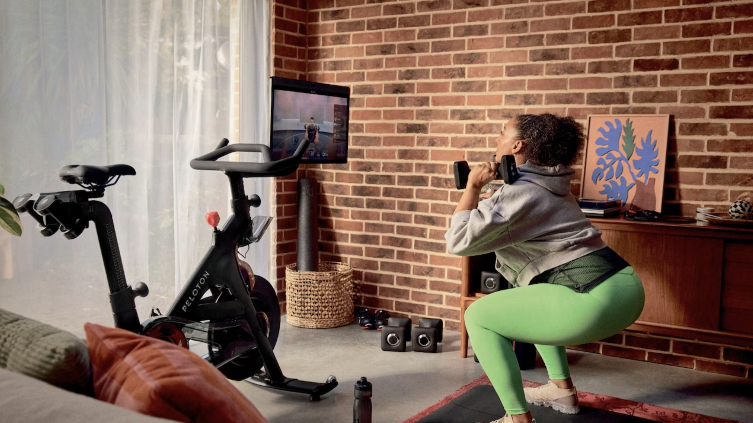
As we were wrapping up the audio ux for Peloton, they pulled us into working with them on their new foray into gaming on Bike and Tread. We worked alongside Peloton’s ux team and their extended gaming partner to create the menu music, menu ux and in game sound design for Lanebreak that helped to bring the game to life.
More in depth case study of Lanebreak in the Work section of our site.
Extending the DNA to Gaming
Unlike brand and UX sound, gaming audio offers room for more color and dynamics. For Lanebreak, we extended Peloton’s palette, adding color and energy. Menu music sets a focused tone, while UX sounds maintain brand consistency with added texture for key moments. In-game, we took a bold departure—crafting rich, ethereal soundscapes to enhance the futuristic, space-like world.
Menu Music & UX
Music & Sound Design
